


Most accessibility problems on school and government websites aren't caused by bad intentions or complex code. They're caused by small, everyday habits: a link that says "click here," an image with no alt text, a flyer saved as a picture. Each one seems harmless on its own. Together, they're the difference between a website everyone can use and one that quietly shuts people out.
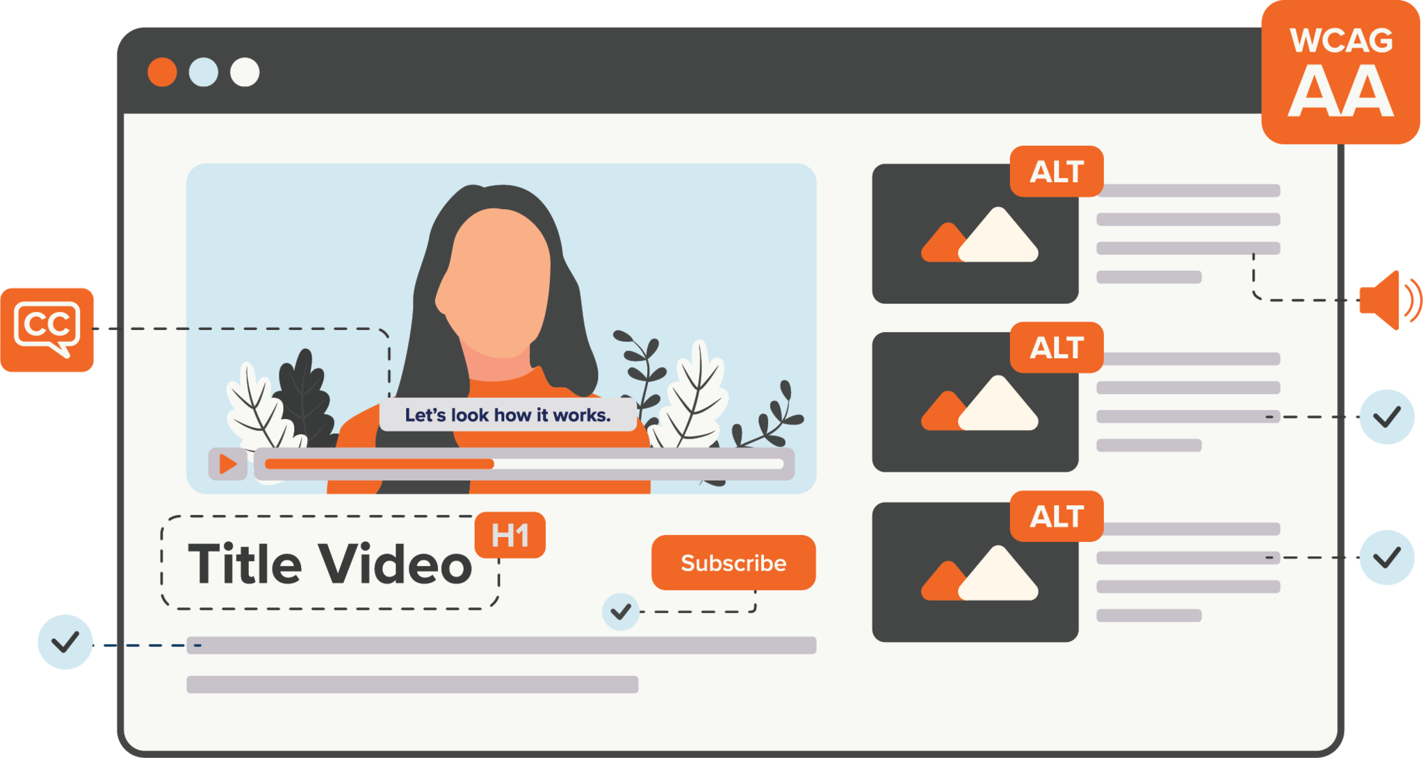
With WCAG 2.1 Level AA now the technical standard for state and local government websites, mobile apps, and documents under ADA Title II, these small habits carry real weight. Covered entities serving 50,000 or more people must comply by April 26, 2027; smaller entities and special district governments have until April 26, 2028. The good news is that the most common offenses are also the most fixable. Here are the ones we see most often, and what to do about each.
The Quick Answer
The most common ADA compliance mistakes on websites are non-descriptive link text ("click here"), skipped or misused headings, missing or unhelpful alt text, low color contrast, inaccessible PDFs and documents, flyers saved as images, uncaptioned video, and improperly tagged tables. Each is a WCAG 2.1 Level AA issue, and each is straightforward to fix once you know what to look for.
1. Non-descriptive Link Text Like "Click Here"
Link text should make sense on its own, out of context. Assistive technology can pull up a list of every link on a page so the user can jump straight to what they need. When half of those links just say "click here" or "read more," that list is useless. A screen reader user hears "click here, click here, click here" with no way to tell them apart. "April 2026 Newsletter" or "9/23/26 Homework Assignment" tells the user exactly where they're going.
Two more habits to watch: don't use the same link text for links that go to different places, and don't use different text for links that go to the same place. Both confuse the people relying on that list to navigate.
2. Headings Used For Looks Instead of Structure
Headings are the outline a screen reader uses to move through a page, not just big, bold text. When headings are skipped or applied out of order, that outline breaks.
Every page needs one Heading 1. From there, headings should nest in logical order: an H3 sits under an H2, a new section starts with a fresh H2, and so on. Jumping from an H2 straight to an H4 skips a level and leaves assistive technology guessing. The fix is simple but important: use real heading styles to organize content, not font size and color to fake the look of one.
3. Missing Or Unhelpful Alt Text
Alt text is the written stand-in for an image, and it's required whenever an image conveys information or is used as a link. Images can't be read by assistive technology. If a graphic is purely decorative, mark it decorative (with an empty alt tag) so screen readers skip it instead of announcing noise.
The trap here is alt text that technically exists but doesn't help. "Kids in class" adds nothing, so that image is better marked decorative. But if an image contains text, like an infographic or a flyer, that text has to be written into the alt text, because a screen reader can't pull words out of a picture. And if an image is a link, its alt text should describe where the link goes, just as link text would.
4. Low Color Contrast (Or Using Color Alone)
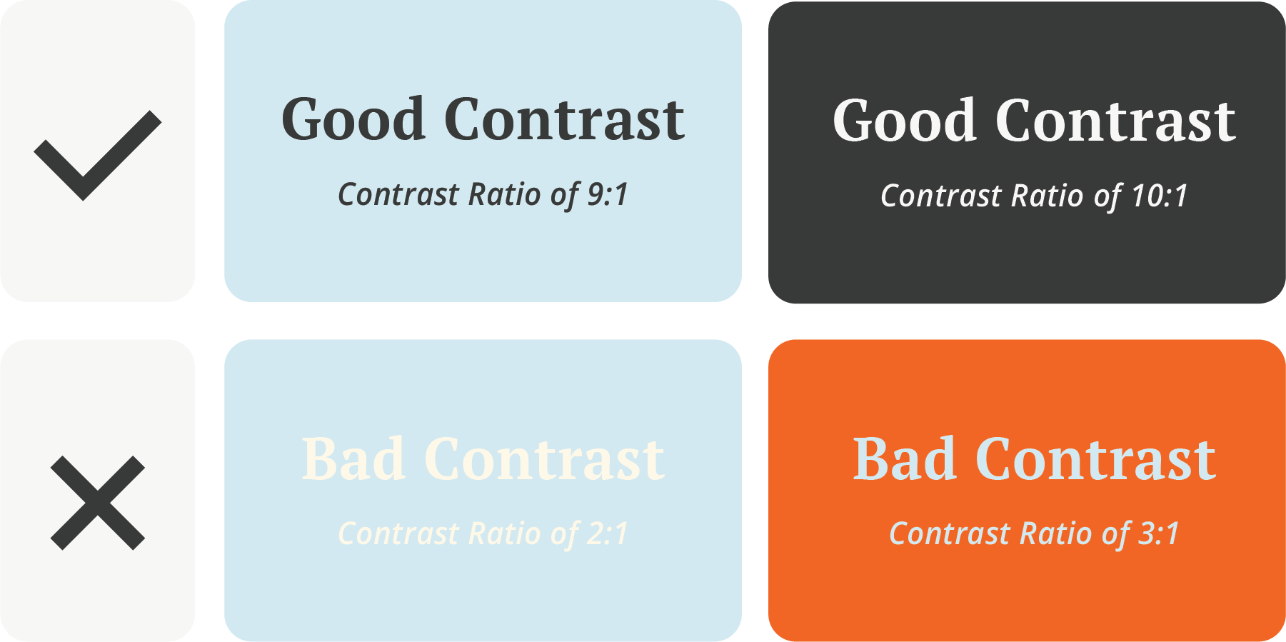
WCAG 2.1 AA requires a contrast ratio of at least 4.5:1 for regular text and 3:1 for large text. If text doesn't stand out clearly from its background, plenty of readers can't make it out. It's worth checking two things: whether your site design already meets those ratios, and whether staff can accidentally choose a non-compliant color when editing content.
A related mistake is conveying meaning with color alone. Things like marking required fields in red with no other cue. Anyone who can't distinguish those colors misses the message entirely. Pair color with text, an icon, or another visual signal so nothing depends on color by itself.
5. Inaccessible Documents And PDFs
Non-compliant documents are the single most common accessibility problem (and the fastest-growing one). Every uploaded PDF, Word file, and spreadsheet has to meet the same standard as the website itself, and they pile up quickly.
The three errors that trip up almost every document are a missing document title, missing structure tags, and a missing language tag. A file can be built perfectly, with headings and alt text in place, and still lose all of it if it isn't exported correctly to keep those tags.
Pro Tip: limit documents in the first place. A lot of content lives more comfortably as rich text right on the web page, where it's accessible by default.
A few habits prevent most of this:
- Add a real document title in the file's properties (Word's checker won't flag a missing one, so you have to do it manually).
- Build structure with actual headings, not resized text.
- Run the built-in accessibility checker in Word or Google (Grackle) before exporting.
- Export "for web / accessibility" so the structure tags survive the trip to PDF.
6. Flyers Saved As Images
A flyer saved as a JPG is just a picture, and a picture isn't accessible. Canva is great for making an attractive flyer, but even saved as a PDF, it often carries problems like incorrect reading order. If you want to post the flyer, include the key information as rich text alongside it so everyone can actually read it.
7. Video And Audio Without Captions Or Transcripts
Video needs both captions and a transcript; audio-only content needs a transcript. Captions are a standard feature now, but auto-generated ones are rarely perfect, so read through and correct the mistakes. When you embed a video, add a descriptive title to the embed as well.
8. Tables That Fight Assistive Technology
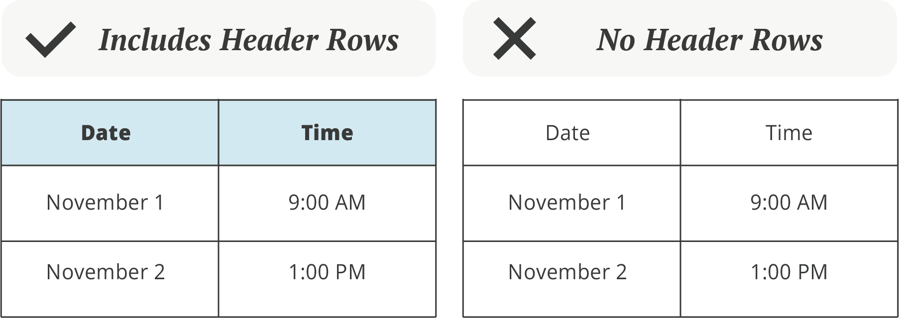
Data tables need their header rows or columns properly identified so assistive technology can read each cell in a sensible order. Tables used purely for layout should be marked with role="presentation". Two things to avoid in data tables: merged cells and empty rows or columns, both of which scramble the reading order.
Don't Forget Mobile
The same principles extend to mobile apps and mobile web, with a few additions. Touch targets should be large enough to tap easily. A minimum of 44x44 pixels. Content should reflow to a single column when zoomed to 400% without side-scrolling. Apps shouldn't lock users into only portrait or only landscape. And every interactive element still needs an accessible name and role that VoiceOver or TalkBack can interpret.
Why An Accessibility Scanner Alone Won't Get You There
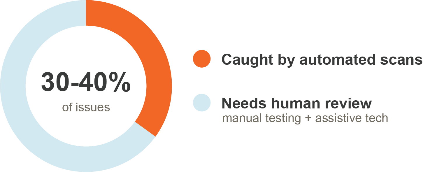
Automated scanners catch only about 30 to 40 percent of real accessibility issues. They're a useful first pass, but whether alt text is actually meaningful, whether a keyboard-only user can complete a form, and whether a screen reader announces content in a sensible order all need a human reviewer using assistive technology. A green score from a scanner is a starting point, not a finish line.
Frequently Asked Questions
What are the most common ADA compliance mistakes on websites?
The most frequent issues are non-descriptive link text, skipped or misused headings, missing or unhelpful alt text, low color contrast, inaccessible PDFs and documents, image-only flyers, uncaptioned video, and improperly tagged tables — all measured against WCAG 2.1 Level AA.
What is the ADA Title II website compliance deadline?
Public entities serving 50,000 or more people must comply by April 26, 2027. Entities serving fewer than 50,000 people, and special district governments, have until April 26, 2028. The required standard is WCAG 2.1 Level AA.
Does an accessibility scanner make my website ADA compliant?
No. Automated scanners catch only about 30 to 40 percent of real accessibility issues. They're a helpful first pass, but full compliance requires manual review with assistive technology.
What makes a PDF ADA compliant?
An accessible PDF has a document title, proper heading structure, alt text on meaningful images, a set language, and exported structure tags. Running the built-in accessibility checker and exporting "for web / accessibility" preserves those tags.
Do decorative images need alt text?
No. Decorative images should be marked decorative with an empty alt tag so screen readers skip them. Alt text is only required when an image conveys information or is used as a link.
How Foxbright Can Help
Accessibility work is a process, not a one-time cleanup, and you don't have to tackle it alone. We've built accessible websites for schools, municipalities, and nonprofits for more than two decades, with ADA compliance built into the platform rather than bolted on. The structural pieces such as keyboard navigation, skip-to links, responsive design, and contrast-safe templates are handled for you, so your team can focus on creating compliant content instead of re-engineering the site underneath it. And when you need a hand, you reach real people who know your site.
Get a clear picture of where your website stands. Request an ADA compliance scan, and we'll show you exactly where the gaps are and how to close them.
Foxbright — powerful websites and personal support for schools, municipalities, and nonprofits. Michigan-based and women-owned, partnering with communities for 20+ years.
As a Foxbright client, you can expect:











 8 Common ADA Compliance Mistakes on Websites (and How to Fix Them)
 Why Your Website Platform Matters: WordPress, PHP, and the Hidden Cost of “Free”
 ADA Title II Web Compliance: The 2027 and 2028 Deadlines for Schools, Cities, and Townships
Want to Learn More About Foxbright?



See the Difference for Yourself
Want a website that’s easy to use and backed by real people who care? Let’s talk about how Foxbright can support your organization's goals today, and for years to come.