Updated Photo Carousel
The Photo Carousel block has been refactored to work better without requiring custom styling. This feature was designed years ago for a specific client and released on all websites at that time. The original version of the Carousel required custom styling on a per-website basis. We've updated the Carousel to be more responsive for different websites and device sizes, removed client-specific colors, and improved functionality when the gallery contains a variety of image sizes or ratios.
For best results:
- Photo Carousel works best with images cropped to the same size/ratio.
- The carousel can work with varying image sizes, however, image sizes should not have drastic differences.
- When placing a Photo Carousel block on the page, use the 'card width/height' settings to customize the 'spread' of the carousel. Experiement with the size as-needed. The 'best' size will depend on the width of the content area, size of the images, and personal preference.
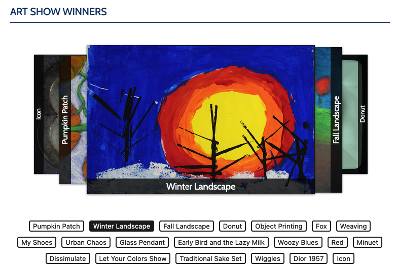
The below example is set to display image titles on the side of each carousel image. Buttons below the gallery can rotate the carousel or point to links added to images, if applicable. These options can be hidden or configured at the block level.
Note: Like most Foxbright features, the Photo Carousel can be customized to individual client needs, if requested.
What Foxbright Clients Say


